Page 1 of 2
Scrollbar on toolbox pls
Posted: Sun Nov 25, 2012 7:04 am
by Jay
Hi Admin
Don't know how other users feel about this stuff?
what would be the chance of getting a scroll bar on the toolbox? it would be better than the scrolling with the mouse wheel, if you have many modules etc you run the risk of gaining and rsi injury

I know the toolbox have various options for searching through your stuff but I reckon a scrollbar would be a great addition!
Also the long bar style of the previews on the toolbox take up to much room imho, the pullout matrix of box previews in SM were much better, you got a better and wider view of your toolkit! could we not possibly have an option to revert the toolbox previews to the old look and pullout/reveal more elements function?
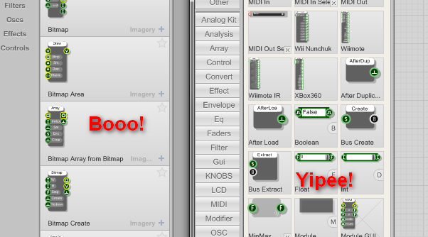
- tooboxes.png (51.97 KiB) Viewed 25240 times
Pretty please

Best Regards - Jay
Re: Scrollbar on toolbox pls
Posted: Sun Nov 25, 2012 8:33 am
by TheAudiophileDutchman
Jay wrote:I know the toolbox have various options for searching through your stuff but I reckon a scrollbar would be a great addition!
Also the long bar style of the previews on the toolbox take up to much room imho, the pullout matrix of box previews in SM were much better, you got a better and wider view of your toolkit! could we not possibly have an option to revert the toolbox previews to the old look and pullout/reveal more elements function?
+1, as for me too the old toolbox was MUCH faster to use in practise.
Re: Scrollbar on toolbox pls
Posted: Sun Nov 25, 2012 12:58 pm
by trogluddite
Jay wrote:it would be better than the scrolling with the mouse wheel
Especially if you don't have a mouse wheel!
I use a trackball or tablet most of the time, which is great for keeping RSI at bay, but the mouse wheel 'emulation' is a bit clunky, so I hardly ever use it.
The up/down arrows are an alternative, but I think they need a bit a tweaking....
1 - They need to be in the same place rather than right at the top/bottom
2 - The scrolling always seems to chop a module 'cell' in half at the page boundaries, so it's easy to miss some of the 'cells' if it's a long list.
Having said that, I'm getting much more used to typing the first few letter of a module name - the search feature seems way better than it was in SM. And I really like the ability to attach multiple tags.
Re: Scrollbar on toolbox pls
Posted: Sun Nov 25, 2012 10:17 pm
by MyCo
I actually like this new toolbox style. But maybe, I'm the only one here, who has the right mouse for that
I use a Logitech G700, this has a free spinning mouse wheel. So when I jog the wheel a little bit, it starts spinning until you stop it, or friction slows it down. Because of this, you don't see scrolling steps, and you can scroll through the whole toolbox just by one single finger movement

Re: Scrollbar on toolbox pls
Posted: Tue Nov 27, 2012 2:43 pm
by Jay
Lol i am a trumpet!
* didn't see those wee blue arrows!
now that i do i don't like the placement of them and I wholeheartedly agree with Trogg that they should be placed together either top or bottom! And they whiz up and down rather quickly! is there a keypress for fine scrolling?
The tagging system is a huge improvement on the old and that is fantastic for ppl who know the names to all their modules,primitives and prefabs! but take me for instance i have been around from the start of sm and have amassed many thousands of bits n bobs, i do not know nor have the time to learn the name of every single component so tagging has very limited usage for me
this would i assume also effect new users who unless they know all the names of the toolkit items are unlikely to be able to make full use of the tagging sys either!
so to sum up my feeling on the toolbox, i think the improved tagging is a boon for ppl who work with them, I personal have hardly ever used it, the other additional toolbox features are nice as well but I cannot get my head round the toolbox preview cells being in one fixed column! It was better to see more items side by side imho. I do like the way the contents get rescaled when the user re-sizes the toolbox! the preview keep crisp even when quite small.
* For the attention of non uk readers! We in the UK have many words and phrases that mean "complete idiot" these include (this list is not exhaustive) - Plonker, spoon, nugget, clown shoe, dunderheed, gormless, divy, pillock, eejit, duffer, prat, muppet, numpty, and of course - trumpet.
What an expressive bunch we are!
Best Regards All
Re: Scrollbar on toolbox pls
Posted: Wed Dec 05, 2012 8:10 pm
by matti
+1
The SM toolbox was way better to use, though FS has it's own good things with search filters etc. A combination of these two would be best

Re: Scrollbar on toolbox pls
Posted: Wed Dec 05, 2012 11:38 pm
by support
Acknowledged. Seems that there are improvements we could make.
Thanks for the comments and suggestions.
Re: Scrollbar on toolbox pls
Posted: Sun Dec 09, 2012 4:46 pm
by tester
I agree with such change.
Right now navigation through modules is really blind and complicated. No direct jump to selected page (and poor page indication). Normally - I visually know where to seek what I need (if I don't remember names), but right now - I know nothing.
Considering, that many LCD monitors are 16:9 and not 4:3 - the earlier toolbox was easier to use.
Re: Scrollbar on toolbox pls
Posted: Tue Dec 25, 2012 5:35 am
by infuzion
TheAudiophileDutchman wrote:+1, as for me too the old toolbox was MUCH faster to use in practise.
Same here. I'd love to have the scroll bar back at least. I think my 18.3" laptop monitor & 21" desktop monitor can handle the extra space used.
Re: Scrollbar on toolbox pls
Posted: Sat Mar 09, 2013 10:42 am
by billv
Jay wrote:Don't know how other users feel about this stuff?
+1
support wrote:Acknowledged. Seems that there are improvements we could make.
Awesome job on the toolbox guys, but Jay's picture tells it like it really is.
It's the only part that I'm missing from SM.