tulamide wrote:I will go with whatever you prefer, but personally I'd go with the "windows folder tree" functionality. Of course we wouldn't need the +/- button, a click on a group or zone would automatically show the childs. I see an advantage in it and that is, you can easily switch between zones/groups while having oversight of the structure. Whereas in the second functionality you always only see the current "subfolder"-content and have to click to get back to the structure then click to get to another "subfolder"-content.
there are pros and cons to both of them. In case of the tree functionality, the tree can get messy quite fast. If you take into consideration that each group may contain several dozen zones, and each zone may contain a dozen samples, whichever sub-folder you chose, its child items will easily cover the full visible list, which effectively kills the benefits of it. Also, we need to keep in mind, that there must be "add group","add zone" and "add sample" button somewhere, which needs to be easily noticeable because it will be used a lot. The "explorer" style would have them all in the same place (switching between them depending on which subsection you have selected). In case of tree structure, there would either have to be some enabling/disabling or switching based on which subsection you have selected.
Despite all of this, I also think the "folder tree" structure is preferable, for being a bit more clear in what's happening under the hood. Perhaps using differently styled "labels" (different font/size/offset) for groups/zones/samples will make it more intuitive.
"Regarding midi: I wasn't aware of your visions regarding them (I thought of a few on/off switches only). Of course, we can do such a change. We could even think of the whole space underneath the global section as switchable, so that, for example, the midi effects don't show the browser, but use the space instead for a wider visual and parameter section.
And in case of audio effects (I know you don't plan on them, but who knows?), they would also have such a section. The same for global, it could have some sort of file browser for presets, for example."
Yes, this was kind of my original intent too. An idea sparked in my head some time ago, that the global section could contain a "description" which would be editable text field. It would be intended to include user-written description of the preset. The sampler may even come in "light version" which would only allow loading presets, not making/editing them - basically it would only have this global tab.
tulamide wrote:What about the size? I decided for one that leaves enough space to always look tidy while showing quite a lot of information. Currently we can change the scale, but when I begin with the design I should rely on a size.
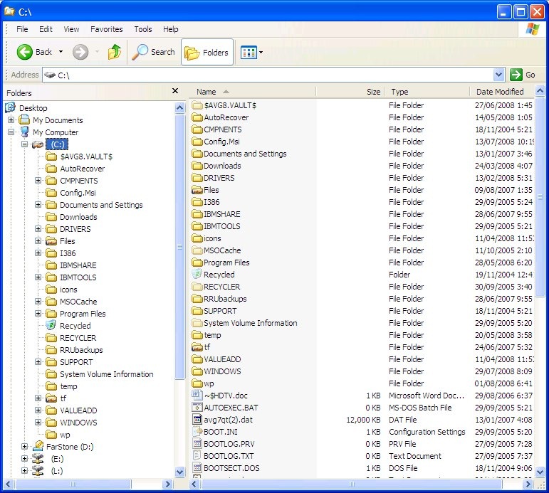
Well, the size is generally a problem with samplers. There is always a lot of info that should preferably be easily accessible. The image you posted covers almost full browser window on my notebook. You might've heard that bootsy had to make a "smaller GUI" version of
one of his plugins, because people complained it did not fit their screens sometimes. Shrinking the GUI concept you posted by 10-20% may be a good idea.
By the way, should I start working on the folder-tree-module? I have something in mind, where the basic functionality would be coded in and the visuals of specific gui elements may be easily modified to whatever GUI you come up with.
