Part 3Before we can continue building the GUI, I have to talk to you about color. It is an important part of any UI. But I was working with a vector drawing program, so I didn't care about colors until all elements and their positioning were done. But my example images for further GUI editing will be colored, so this is the perfect time to talk about how and why I chose the colors.
The first term you need to know is
monochromatic. Although mono is part of the term, it does not mean to just use one color. It means to use shades of just one color, but as many as you like. If you've ever seen a greyscale photo, you know what
monochromatic is. Here's an example image:

If you have a look at the GUI again (a few posts above is the link), you will notice that it has a lot of that monochromatic look. In fact, it
is monochromatic with two additional highlight colors. It is relatively easy to build matching colors when orienting at monochromatic looks. That's why I used it here. Of course that's not the only way you can create your set of colors. There's a wide field of
color harmony and
color theory that will guide you through the process.
I knew I wanted to create a dark theme. That means, the dominant color, for example the background color of the GUI, should be a dark one. I also like all kinds of blue. And I knew I didn't want to have strong colors. So the dominant color I decided to use is a blue-ish dark grey. From there I created two lighter colors, based on the dominant one. Finally I created two variants of the lightest color. And that's it. Here is Sinner's color palette:
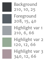
- Sinner-Color-Palette.png (4.79 KiB) Viewed 14140 times
The values are in HSB format: Degree, percent, percent (for example 210°, 10%, 25%). The slight difference in hue for the foreground color is due to Illustrator working in YMCB-color-space. It is a bit narrower than HSB and therefore can't map all colors exactly. So please see the 208° as actually 210°. So we have 3 shades of the same hue. For the additional highlight colors you will see that I doubled the saturation from 6 to 12%. This wasn't by accident. If you have a look at only the last 3 color of the palette you can see that they have the same weight. They seem to just differ in hue. If I'd used 6%, they would have seemed to be paler than the original highlight color (var 1).
Whatever your favorite colors are:
Less is more!You should aim for 3 to 6 colors most of the time. People won't be attracted to GUIs with dozens of colors, especially if they are over-saturated. Which brings me to another example. While in my palette the dominant color is a dark one, and so the other colors were lighter. If I use nearly the same values (for example from background to foreground the brightness was increased by 60% from 25% to 40%), but for a light dominant color, I obviously have to decrease brightness and saturation. But does this still look good? Well, decide for yourself.
Let's imagine someone's preferred color would be a nasty orange. I know, who would ever prefer such an eye-hurting color? But still, let's just assume there would be one person in the whole wide world. How would the color palette look like if done similar to Sinner? Like so:
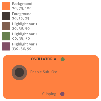
- Orange-Color-Palette.png (13.72 KiB) Viewed 14140 times
In this case the dominant color is also the lightest instead of the darkest, etc. Everything is reversed. And doesn't it look beautiful? Apart from the orange of course which is still burning my eyes...
Now that we have our colors, we can't just use them freely. Obviously, the dominant color can only be used for the background. The foreground color should be used for all elements' basic shapes (incl. text), and the highlight colors should be used to point the user to important parts (as the bars of the envelopes, or the sweep of the knobs).
So why did you use 3 highlight colors then, you ask? Because they point to different parts/purposes. While highlight var 1 is already explained, highlight var 2 is used only for switches, and highlight var 3 shows the elements that are modulated by the LFOs.
Now that you learned a bit about colors, you might want to know more. For a very, very brief overview of color theory (for those too lazy to read more than a few paragraphs), have a look at
http://graf1x.com/color-wheel-history-and-explanation/Those who want to invest more time in this very important aspect of GUI design, have a read here (and its following pages):
http://www.tigercolor.com/color-lab/color-theory/color-harmonies.htm-to be continued-